

If you look at this chart of Moderna what do you see? Does anything about this chart tell you how people will evaluate the company?
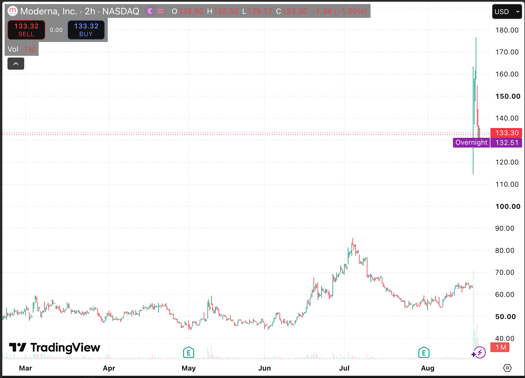
Or does it just show you price? Does it show you liquidity? Does it show you inflows/outflows of smart money? A lot of people think the price reflects value. It doesn’t. It reflects psychology.
There are these fidget toys called Squishy Dumplings that sell for $5.00 right now. They were all the rage on TikTok a few weeks ago and have sold millions.
Just to ball park it maybe 100k people have bought one of these toys for $5.00. Does that mean they are worth $5 to the other 8 billion people on Earth? Is a Ferrari worth $500k?
If a Ferrair was priced based on what the average person who participates in the “car market” i.e. the average person who owns a car would that price be anywhere near $500k? The fact someone paid $500k for a Ferrari does not mean the car is worth that nor that you should pay that.
Nor does it mean $500k is too high a price and you should “short” sell a Ferrari either.
There is NO ALPHA IN PRICE. This is why all technical analysis is bullshit.
Here is one of our model charts with no price. The green dotted line is average per share cost i.e. what people have paid. The green “channel” (shaded band) is where the code predicts those 8 billion people who aren’t buying Squishy Dumplings would buy them. The purple diamonds are changes in liquidity. The blue dotted line is the full model entry calculation. This is where Buffett, Burry et all likely would buy based on modeling.
Yes, those men are very dumb traders (consistent, inflexible, dumb) and can be predicted very easily within error.
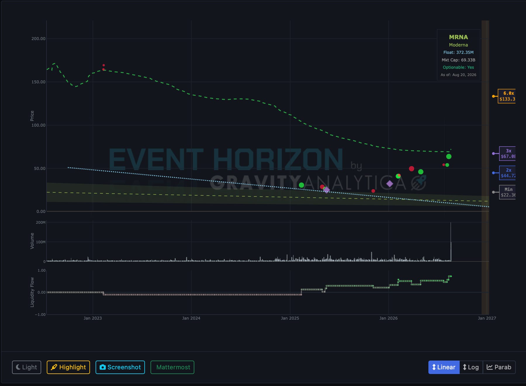
And none of those color coded markets and lines have anything to do with price. I could trade stocks blind of price information.
Where would you buy? Use your finger. Where is that point?
Here is the chart with the price added to make sure you get the point.
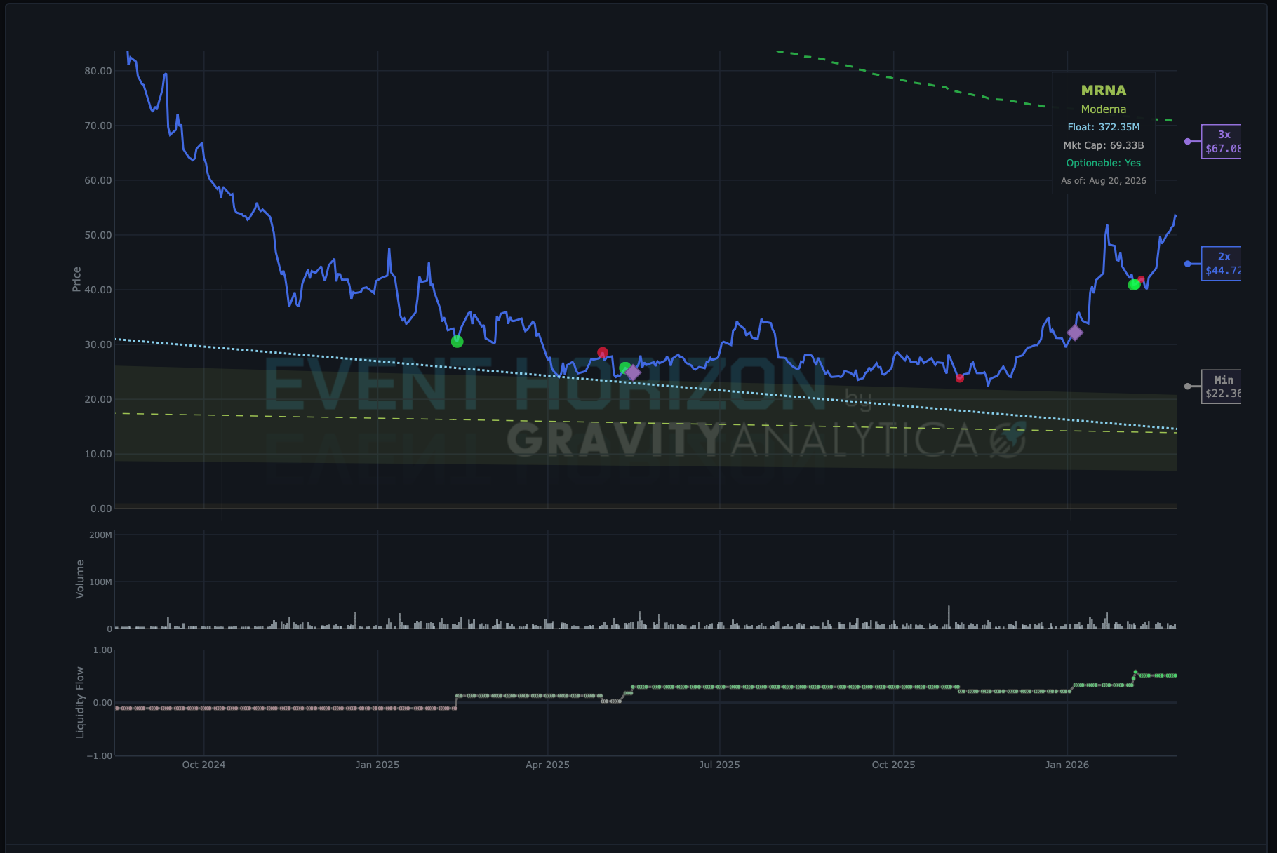
In January of 2025, smart money started buying Moderna. I even posted the day this started to play out.
Then liquidity dropped. Liquidity then dropped again in January 2026. When there is a change in liquidity it usually means liquidity has dropped. When liquidity drops, if the stock is in the range most people would buy it, the price tends to go back up. This is an actual squeeze. There are many types of squeezes. Demand squeeze, attention squeeze (i.e. more people hear about a stock today than new about it yesterday - ahem say after two dozen articles are written,) short squeeze - which can occur in hours or months, etc.
Go back and forth between the chart with the price and the one without. Do you notice all the green dots - that follow the purple diamonds? Those are new institutional filings. The dot position is by filing date which is usually post-dated to transaction date. Do you see how the purple diamonds follow the dip into the channel?
You can see institutions were buying. Just use your fingers and follow along the chart without price and then look at the price. Price follows smart money.
It’s all really obvious when you use the right charting tools. We are no longer holding ($MRNA.)
—AJ
PS. Unfortunately, because distribution, dilution and retail frenzy all usually overlap we can’t (yet) measure liquidity changes on exit. Which is why we exit on events. Not price. And not on any code alert.
People who know markets enter before people who don’t. But, everyone tends to trade in the rush. So it’s hard to separate out intention.